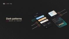
A deceptive pattern is an attempt to persuade users to do things they might not otherwise do. This type of dark patterns in UX design makes it difficult for users to express their actual preferences.
Are there any products or newsletters you’ve signed up for that automatically deduct from your credit card when the free trial period ends? Have you noticed that it’s difficult to unsubscribe from that product as well? The pattern is deceptive, isn’t it? Harry Brignall coined the term “dark patterns in UX” in 2010 to draw attention to this practice and build support for bringing it to light.
Choose Your Perfect Product Partner - https://hiehq.com/

